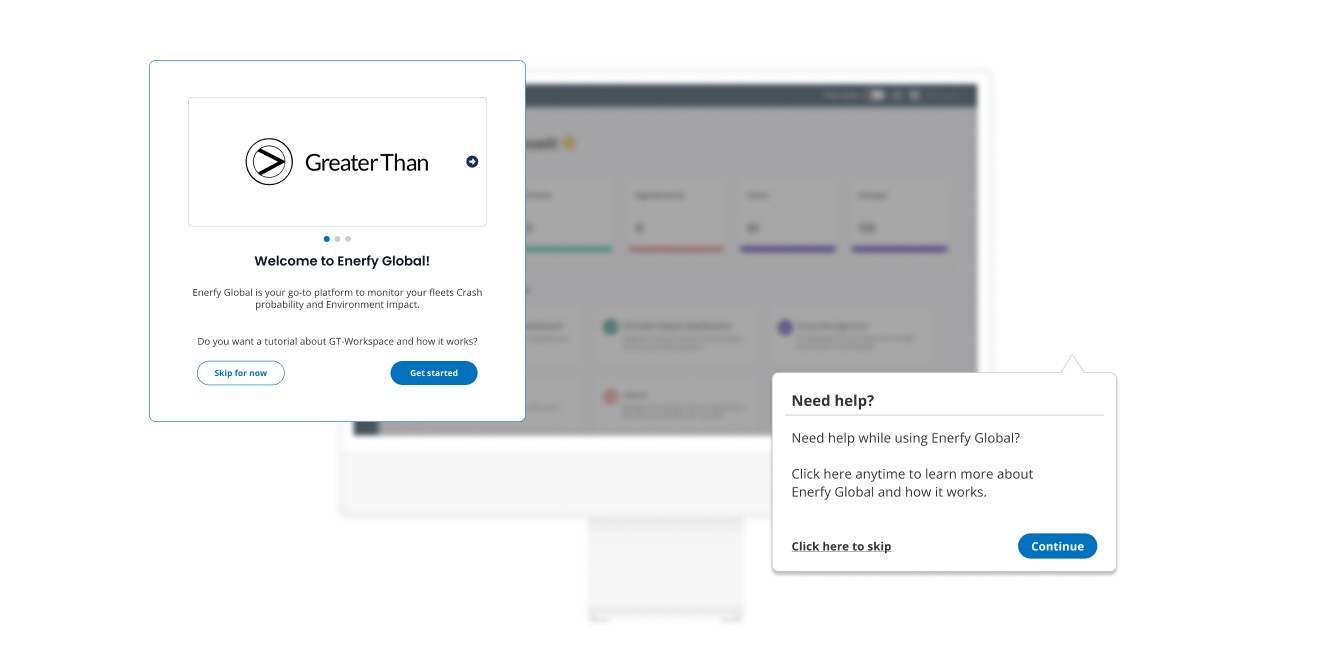
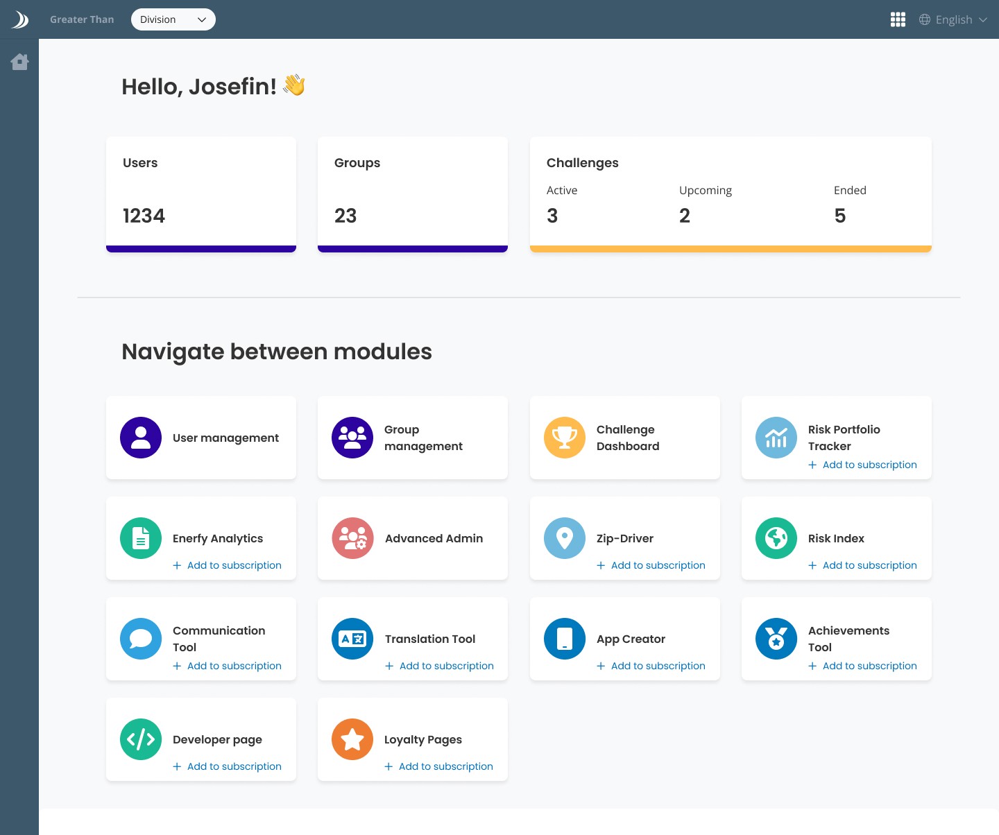
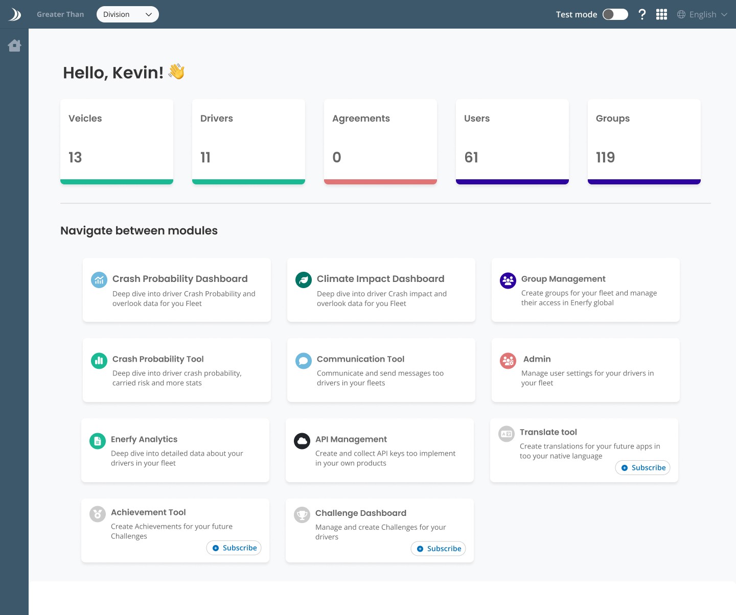
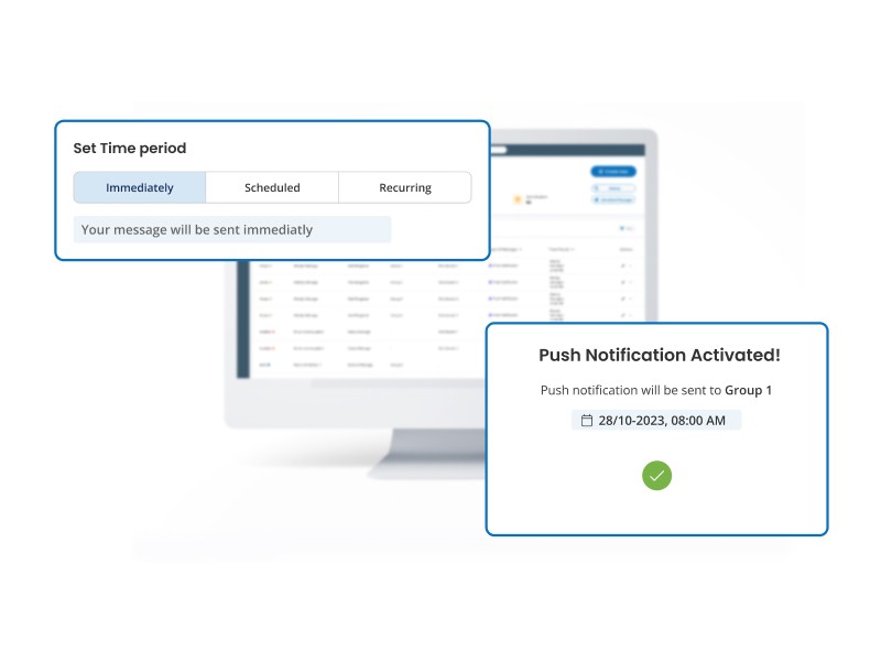
Enerfy Global, is a web platform created to help companies analyze driving data for their fleets. With the help of several modules and tools within Enerfy Global, companies can get help seeing how safe their drivers perform in traffic, how much impact they have on the environment, and how they can engage their drivers into driving more safely.
My part in this project was to design an Interactive onboarding and a new Start page, helping new users get started and get good guidance when starting to use Enerfy Global.
Problem
At Greater Than, we've noticed a challenge for new users: to get started with Enerfy Global and it was difficult getting information how the product works.
This means that when someone joins us, they're kind of left on their own to figure things out. It's like being thrown into the deep end of a pool without knowing how to swim.
Without a good Onboarding process and a solid start page, new users can feel lost and stressed out and they might not understand what they are suppose to start with.
This can make them less productive and increase number of calls to Customer service with questions that could have been avoided.
Solution
To address this issue, we recognized the need for a solid
Interactive onboarding and a Informative starting page, aimed at swiftly integrating new users and make them feel welcomed from the start.
By providing clear and user-friendly guidance right from the start, we lower the entry barrier for new users, ensuring a smoother transition into
Enerfy Global .
Through the implementation of a comprehensive onboarding process,
we aim to form a supportive environment where new users feel helped and assured when accessing Enerfy Global. This not only enhances their overall satisfaction but also alleviates the workload for our Customer service team, resulting in a win-win situation for all involved.
Client
GreaterThan
My role
UX/UI Designer
Team
1 UX/UI-Designer
1 Developer
Year
2024
Who is the user?
To tailor our Interactive onboarding to meet the needs of Greater Than's existing and prospective customers, I embarked on a research journey to explore how other companies approach their onboarding procedures. Additionally, I reached out to Greater Than's customers directly to gather insights into the pain points they currently experience.
From the outset, I prioritized the creation of an onboarding experience that had a balance between simplicity and informativeness. Given the complexity of the information housed within Enerfy Global, it was crucial to ensure that new users could easily navigate the platform while still gaining a comprehensive understanding of its functionalities.
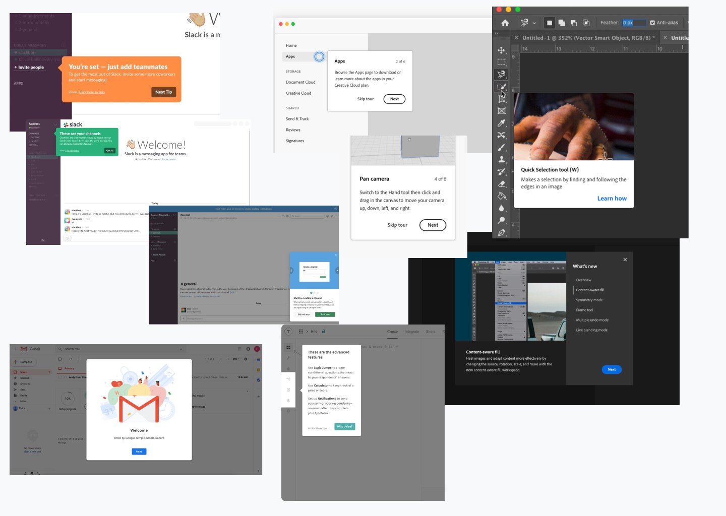
Let's find inspiration!
I started to scan around the internet to find different websites and how they introduce their new users into their product. With good inspiration from the other websites, I gained solid knowledge on what felt important to move forward with our project.
The 3 most important insights I got were:
Selective focus: Specific areas of the platform would be highlighted while the rest would reamin in the background, reducing cognitive overload.
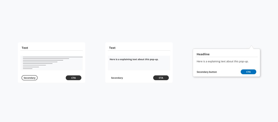
Explanatory Pop-ups: Pop-ups that appear when a particular area of focus is selected, offering relevant information at the right time.
User control: Users have the option to cancel the Onboarding process at any time, so that they don't have the feeling of being pressured.
Informative: User would get good and explaining information regarding what different features and tools means.
Additionally, I also wanted to interview 4 people about what pain points they felt using Enerfy Global today. Unfortunately with the time constraints I had, I got to interview 2 people, but got valuable insights and paint points from them:
Difficulty to understand all the information upon logging in.
Lack of guidance on where to start within the platform
Insufficient explanatory text regarding the different products offered.
All these insights from Market research and interviews, helped me going forward and addressing user needs in my future design.
Define
Based on the User research I conducted, the main problems that I would have to focus on are:
Craft a user-friendly UX flow with a focus on showing the Onboarding process.
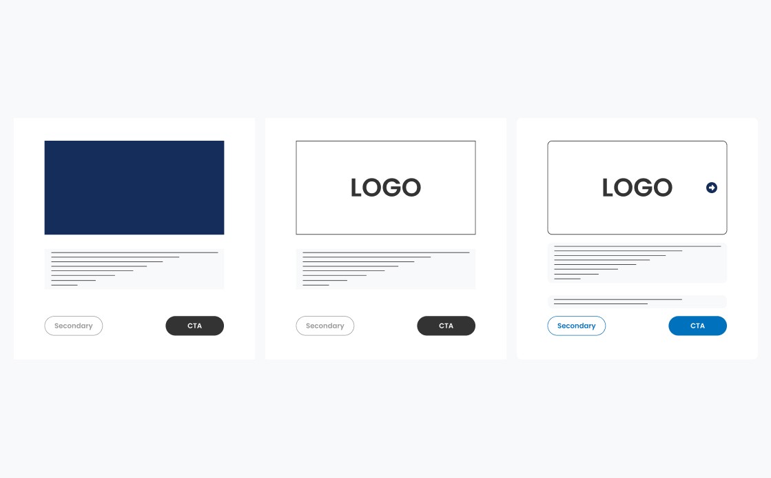
Design clear and visible pop-ups, to help users easily understand the information.
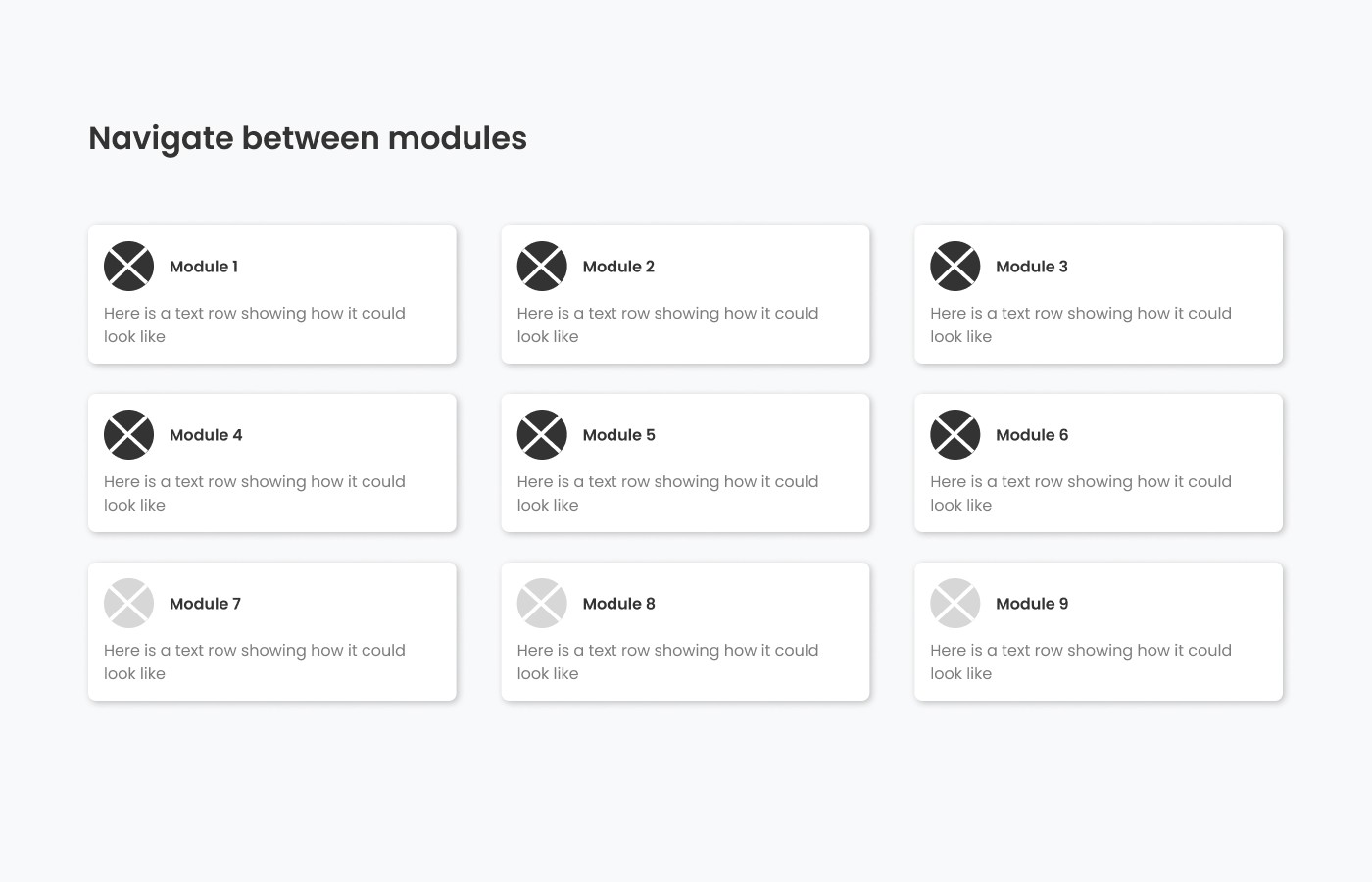
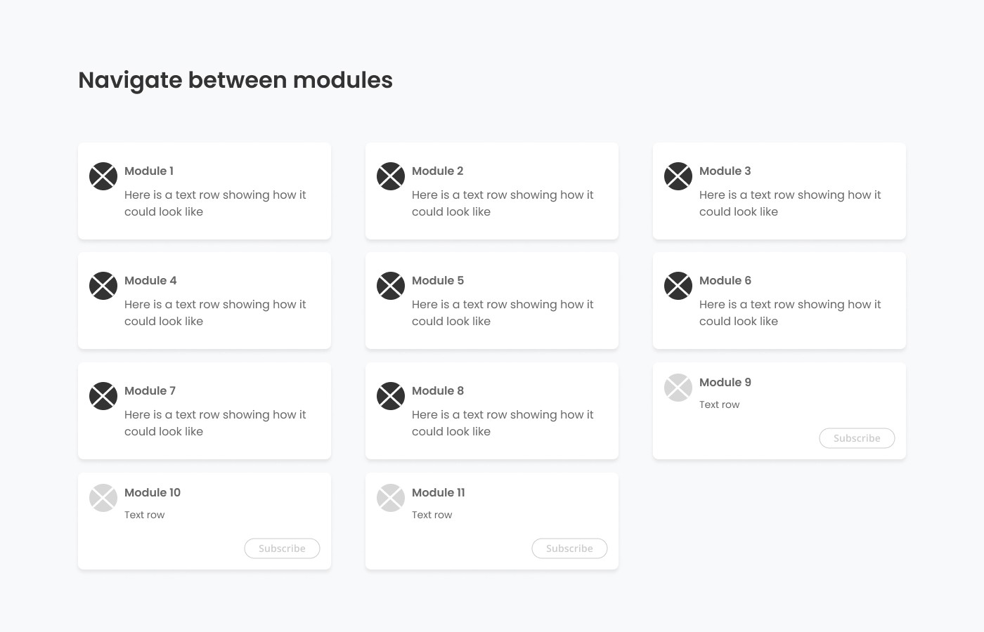
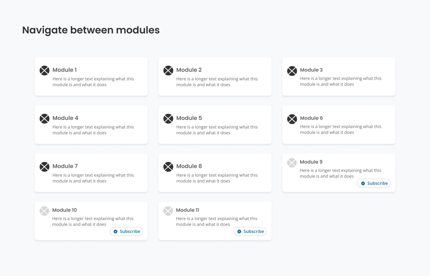
Re-design the start page with clear explanatory text about our different products.
These insights helped me along my design process, helping to refine the design and functionality of the Onboarding and Start page.
What to focus on designing?
Is this working?
Challenges
